

"Colors, like features, follow the changes of the emotions." - Pablo Picasso
Color is a powerful communication tool and can be used to encourage you to act, make you feel a certain way and even make your body react. Certain colors have correlations with physical reactions/changes, such as increases in blood pressure, metabolism (yes, please!) and even eye strain.
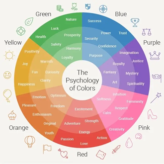
The psychology of color refers to the impact that different colors have on human emotions and behavior. Color is a powerful tool that can be used to influence the way people perceive and interact with visual information.
Color plays an important role in marketing, communications, building a brand, or rebranding an existing company brand. In a study on the impact of color on marketing, researchers found that 90% of product judgments are based on color alone.
If you are looking to inspire your audience to act (ex. employees to enroll or participate in a benefits program), consider using purple, orange, yellow or blue in your communications. These colors are often used to create positive engagement. Select colors that draw attention but don’t forget to include white space in your design. Not only does this help with readability but it also highlights your message more effectively than overwhelming your audience with too much color.
Source: https://howtoartist.com/colors-and-emotions/
Use Color to:
Get Attention
Color can also be used to create visual hierarchy, where certain elements of a design are emphasized over others. For example, using a bright color for a call-to-action button on a website can make it more prominent and increase the chances that a user will click on it. Consider the rule of 60-30-10:
-
- 60% - Select a dominant color. This is often your “white space” where the eye can rest and be able to take in information more quickly and easily. But is can also be a non-neutral color, if you want to select a specific color for brand recognition/dominance (for example, blue for Prudential and red for Netflix).
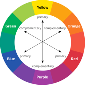
- 30% - Choose a secondary color that complements the main color.
- 10% - Add an accent color to highlight something important you want employees to see or act on. Take advantage of the “isolation effect” where an image or text is more clearly recognized and remembered if it stands out from the background.
Support Your Communication Goals
Looking to attract new employees? Go bold – bold colors draw attention. Have a new benefit to promote? Use bright colors to highlight the new information and calls to action. Forbes reports that green can inspire creativity, red may negatively impact analytical thinking, and blue is found to be soothing. Determine the experience and environment you are looking to create and use colors that will help you achieve that goal.
Connect with Emotions
Color can be used to create specific moods and to guide the viewer's attention. For example, warm colors like red, orange, and yellow tend to create a sense of excitement and draw the viewer's attention, while cool colors like blue and green tend to create a sense of calm and relaxation.
Complement Your Company’s Brand
Color improves brand recognition by 80%! Use colors that complement your brand. Avoid colors that clash and consider creating an internal brand (even a benefits logo) that uses elements to bolster your brand identity.
Source: https://www.peachpit.com/articles/article.aspx?p=2162084&seqNum=2
Consider the color, blue.
Did you know…?
- Blue is the most used color in corporate branding.
- Blue represents trust, friendship, dependability, peace and serenity.
- Blue is the #1 favorite color worldwide.
- 76 countries have blue in their flag.
Keep in Mind…
Feelings about color can be very personal and influenced by your culture. For example, in many Western cultures the color white represents purity and innocence, but it is a symbol of mourning in many Eastern countries. In the U.S., red signifies danger and a signal to stop, yet it also illustrates love and passion. However, in China, red means good fortune, celebration and happiness.
So, choose your colors accordingly!